Table of contents
Open Table of contents
Why Build a Personal Site?
Every developer needs a place to call their own on the internet. A personal site isn’t just a portfolio, it’s a reflection of how you think, what you care about, and how you approach problems.
I wanted something that was:
- Fast and minimal - no heavy JavaScript frameworks if I can avoid it
- Easy to maintain - markdown for content, simple deployment
- Aesthetically pleasing - dark mode, clean typography, thoughtful design
- Educational - I wanted to actually understand how everything works
The Tech Stack
I chose Astro (btw, this is the first time I’m working with Astro) with the AstroPaper theme as my foundation. Astro is perfect for content-focused sites because:
- Zero JavaScript by default - pages are static HTML unless you explicitly add interactivity
- Content Collections - type-safe markdown handling with schema validation
- Component Islands - you can sprinkle in React/Vue/Svelte components only where needed
The AstroPaper theme gave me a solid starting point with blog functionality, dark mode, and good SEO practices baked in.
Enter Claude Opus 4.5 and Antigravity
This is where things got interesting. Instead of manually tweaking every CSS class and hunting through documentation, I paired up with Claude Opus 4.5 through the Antigravity AI coding assistant.
Here’s what that workflow looks like:
Rapid Iteration
When I wanted to redesign my About page, I simply described what I had in mind - a Steipete inspired layout with a photo, prose-style bio, and tech stack cards with icons. Within minutes (although there was some trial and error, fixing things here and there), Claude had:
- Converted the page from Markdown to an Astro component
- Added Lucide icons for visual flair
- Implemented a responsive two-column layout
- Set up the GitHub contribution graph embed
Understanding the “Why”
What I appreciate most is that Claude explains why certain approaches work better (and this is because I had workspace rules setup in Antigravity). When I asked about using MDX vs Astro components, I got a clear breakdown of trade-offs:
- MDX: Great for content-heavy pages where you want markdown syntax with occasional components
- Astro: Better for complex layouts where you need full control over structure and styling (and I chose this approach for my About page)
Debugging in Real-Time
When the Lucide icons weren’t rendering (500 error), Claude quickly identified the issue—the astro-icon integration wasn’t registered in the config and fixed it. No searching through GitHub issues or Stack Overflow.
Features I’ve Added
Here’s what my personal site now includes:
Reading Time Display
Every blog post shows estimated reading time, calculated using the reading-time package. This appears both on the posts list and individual post pages:
📅 8 Feb, 2026 · 5 min readClean Navigation
Removed the Tags button from the header (I don’t have enough posts yet to warrant it). Tags are still accessible at the bottom of each post.
Responsive About Page
- Two-column layout on desktop (photo + bio)
- Single column stack on mobile
- Tech stack displayed in icon cards
- GitHub activity graph
- Social links with icons
Projects Showcase
Compact project cards with:
- Inline GitHub/Live links
- Tech stack tags
- No awkward line breaks on project types
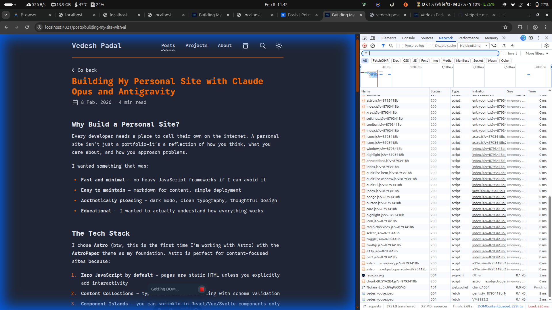
Image Zoom
Added lightbox-style image zooming (using medium-zoom) for better readability on all devices. Just click any image to expand it!
What’s Next
I’m planning to add:
- More blog posts documenting what I learn, and other thoughts I have (not just technical)
- MDX-based blog posts for React components that I plan to add in the future
The Meta Experience
If you’re thinking about building your own site (if that is based of a tech stack that you are not aware of), my advice: start simple, understand your tools, and don’t be afraid to iterate. Having an AI pair programmer makes the iteration loop incredibly fast, you can try ideas in minutes rather than hours.